It’s not about winning,
it’s about taking part.
My entry to the Tokyo 2020 Olympics logo competition was a labor of love and a learning opportunity, inspired by the original Olympic ideal.
Written by Rafael Oliveira
When I started running about five years ago my times seemed to get faster with each race I entered. I started to dedicate more of my time to running, and along with an insatiable appetite for information I tried it all: doubling, intervals, track workouts, strength and conditioning, you name it.
I finally got my marathon time below 2:45 in Barcelona in 2013 and my friends started asking me if I could ever make it to the Olympics. I understand that for someone who isn’t into the sport, this question seems legitimate. But for someone who was quickly learning how hard you need to train just to shave a minute or two from your marathon time, the idea of going to the Olympics seemed about as likely as being chosen to be Portugal’s first man on the moon.
The question was laughable, and I won’t be going to the Olympics as an athlete anytime soon; if I wanted to find a way into the Olympic family, I knew it would have to be by the back door.
When I heard that Tokyo 2020 was scratching its original identity — designed by Kenjiro Sano — because of the controversy over plagiarism, and hosting a competition to design a new logo, I spied an opening. Typically I don’t like working on spec with only a one-in-a-million chance of ever getting paid, and I even supported AIGA’s view on the matter, made via an open letter opposing this approach, but the more I thought about it, the more I drew parallels between my professional life as a graphic designer and my sporting life as an amateur athlete.
I came to the conclusion that as a freelancer taking on the logo competition I was sort of like an aspiring athlete trying to get into the Olympics — it’s hard to compete against well-funded professionals, but what is the Olympic Ideal, if not to encourage competition purely for the love? I had to risk working with possibly no chance of reward, much like an athlete trains with the constant risk of injury or being denied a shot at a lifelong dream because they get beaten by a doper. Or in this case, for failing to appeal to a committee of 20 people deciding on something as complex and unique as a logo for the Olympic Games…
I had to give it a go. If I wasn’t going to toe the line of the Olympic marathon I was at least going to try and come up with a cool logo for the most important event in sports history.
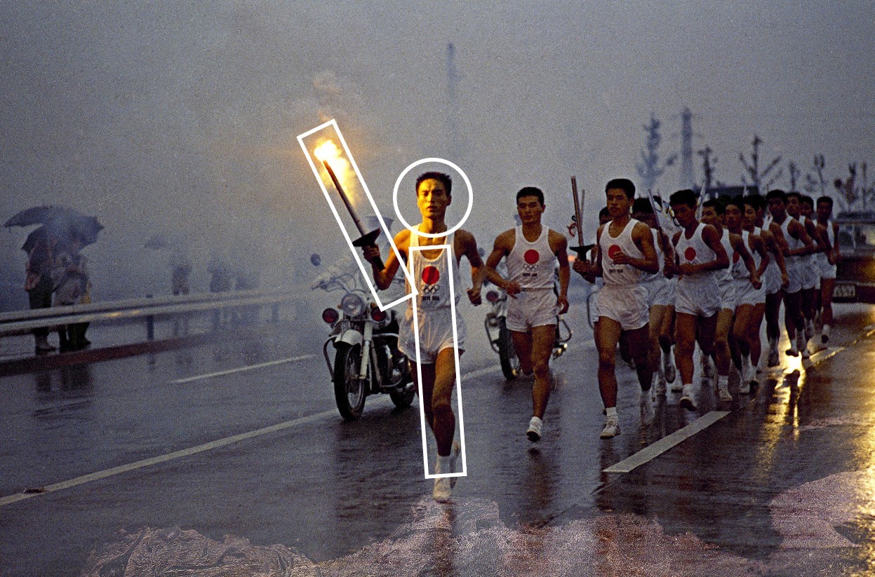
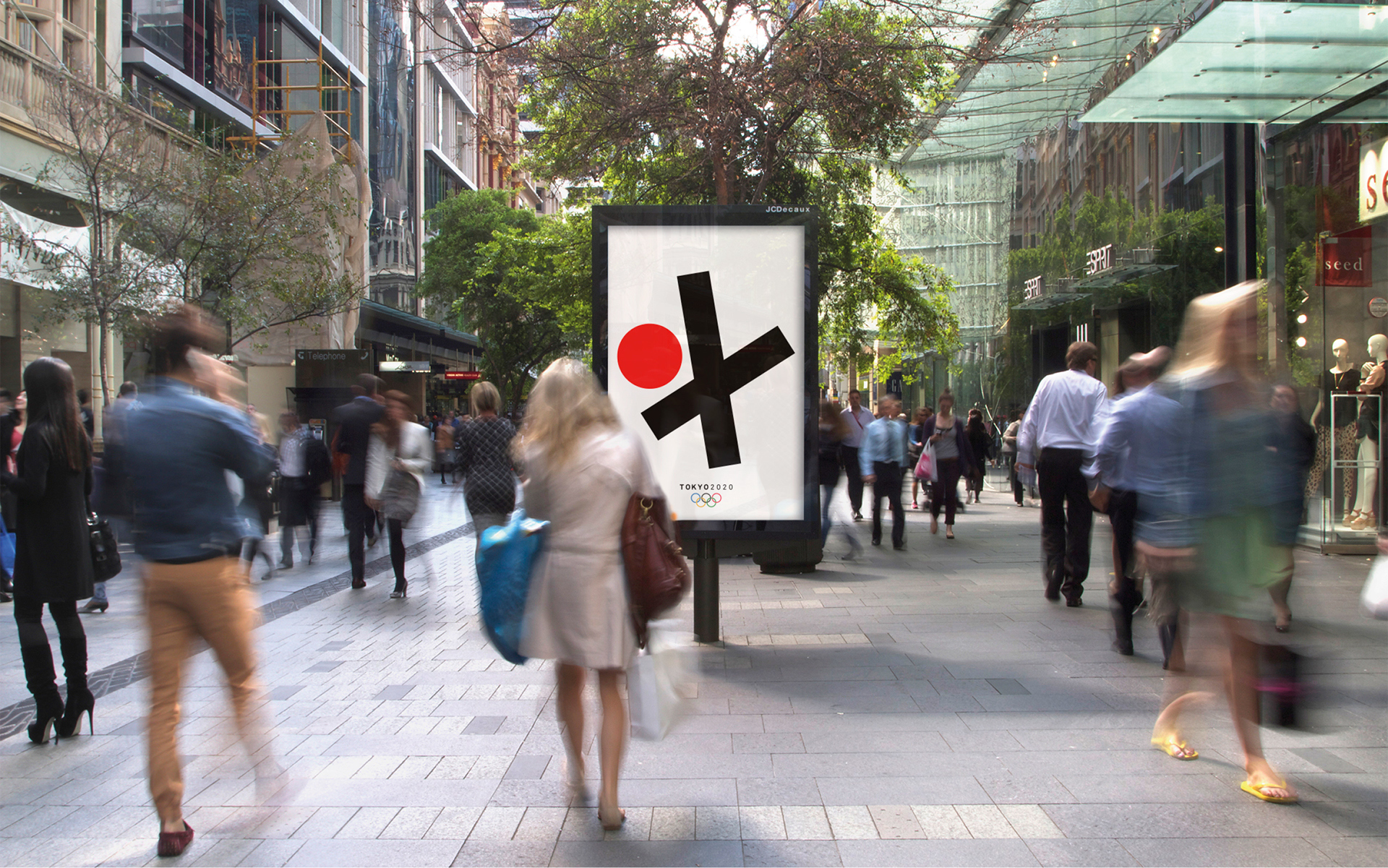
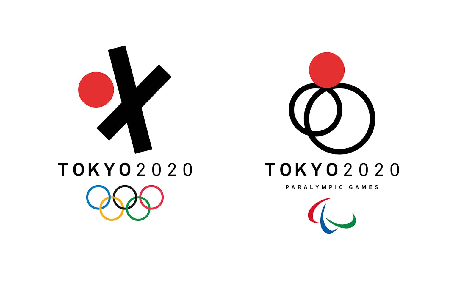
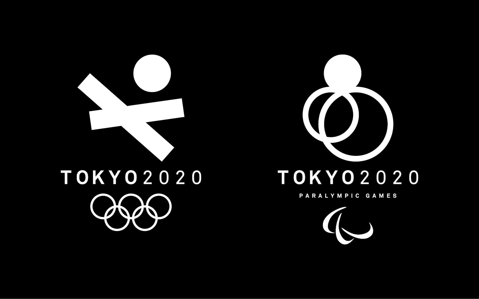
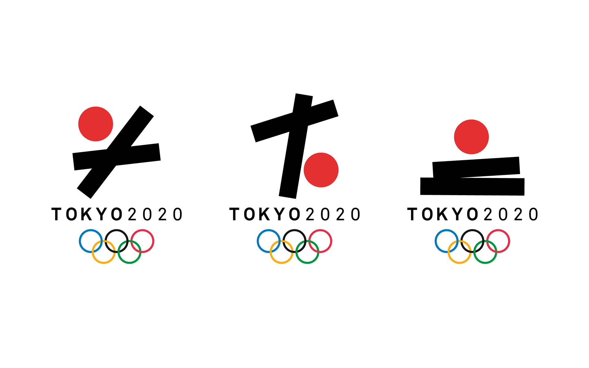
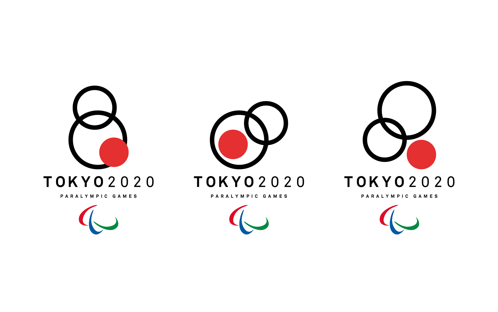
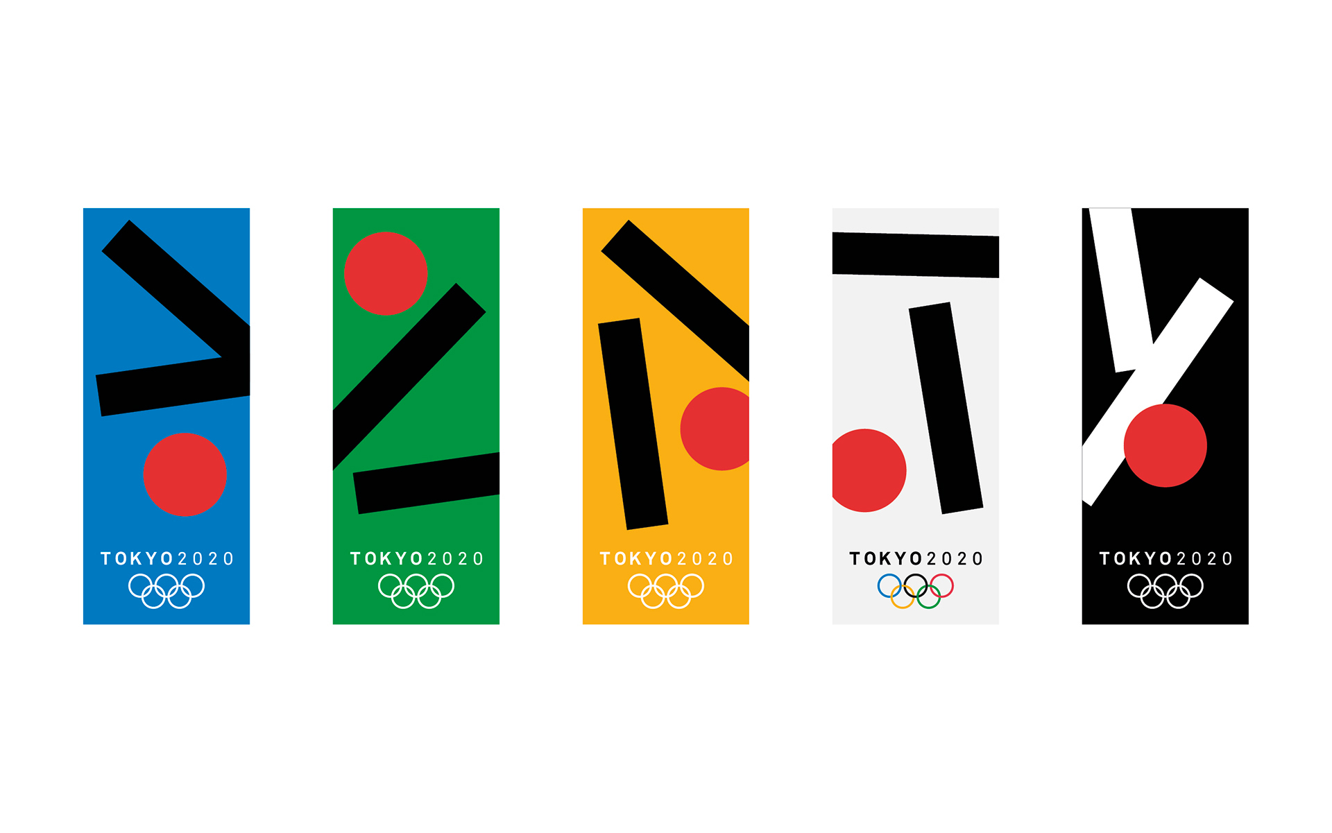
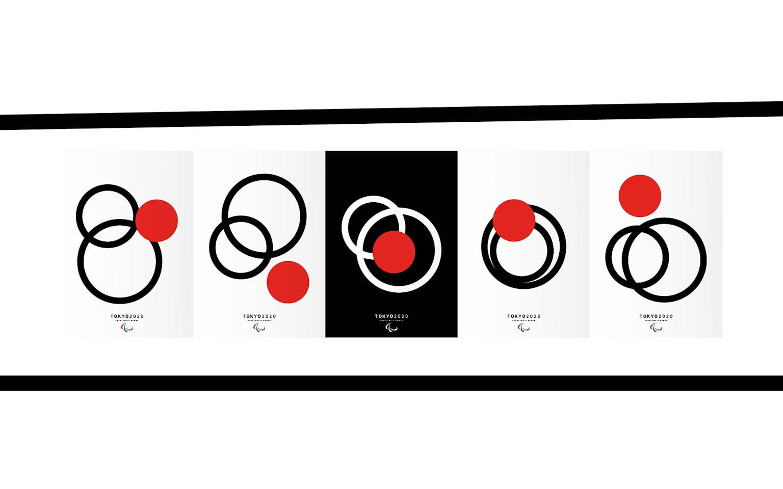
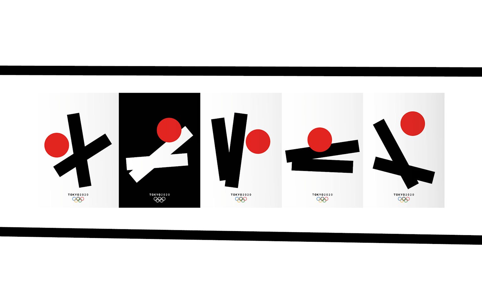
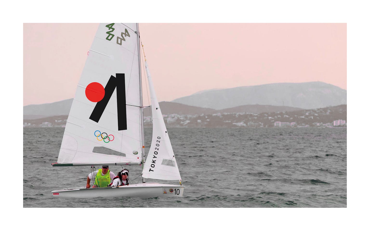
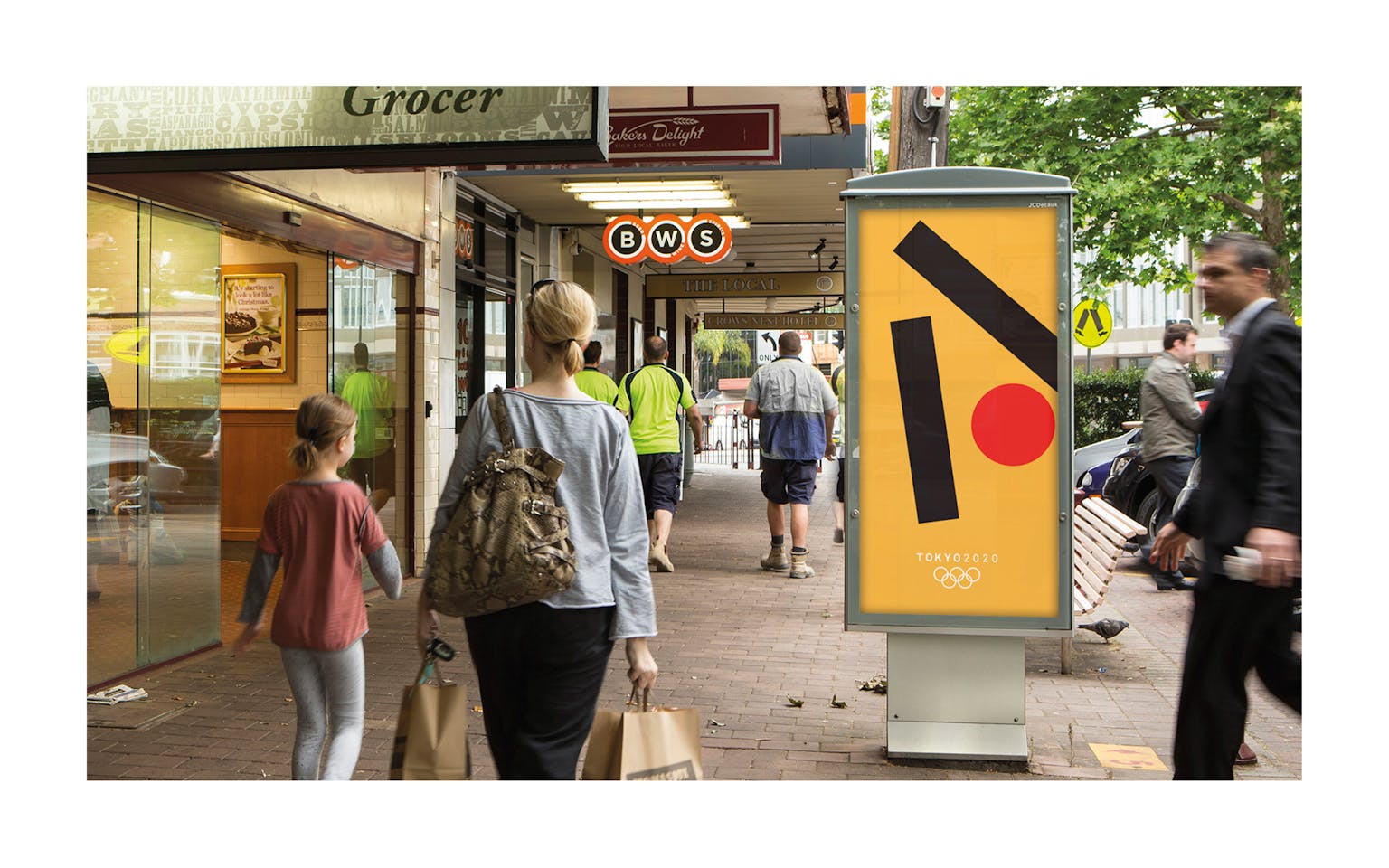
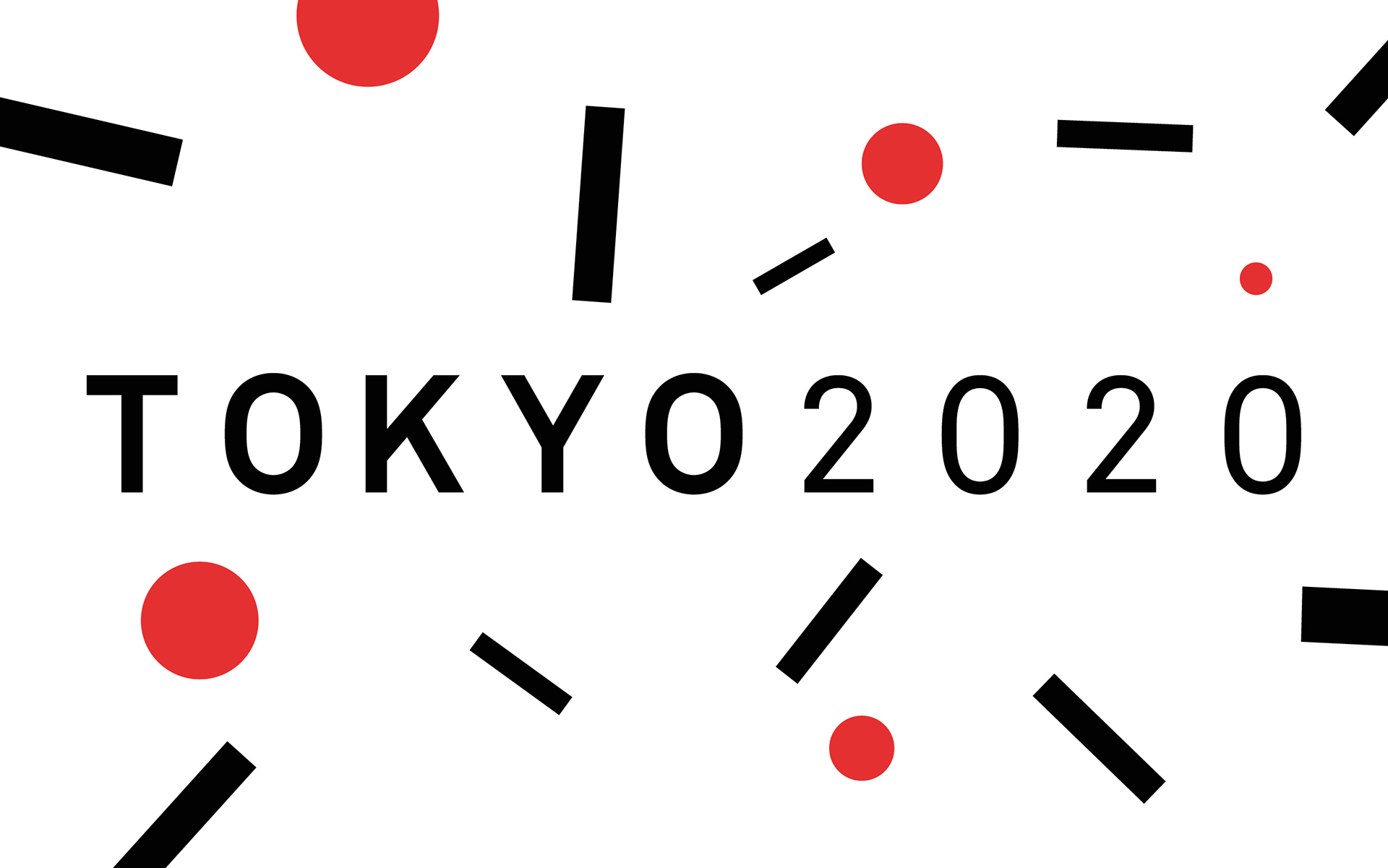
I came up with a logo proposal, but most of all an identity system, that in my view is a representation of the Olympic spirit, stylising the human form and conveying the idea of movement, inherent to sport. I also wanted to pay tribute to the original 1964 Tokyo Olympics logo designed by Yusaku Kamekura.
My design is heavily influenced by the Japanese Wabi-sabi Zen aesthetics, which in turn resonate with some values that sport and athletes aim to achieve:
- Fukinsei: asymmetry, irregularity
- Kanso: simplicity
- Koko: basic, weathered
- Shizen: without pretence, natural
- Yugen: subtly profound grace, not obvious
- Datsuzoku: unbounded by convention, free
- Seijaku: tranquility
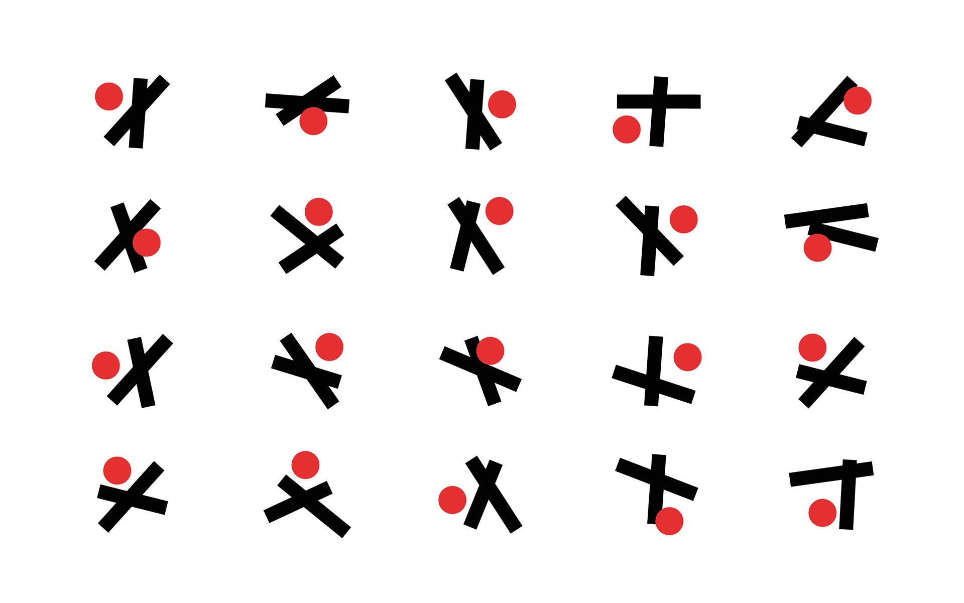
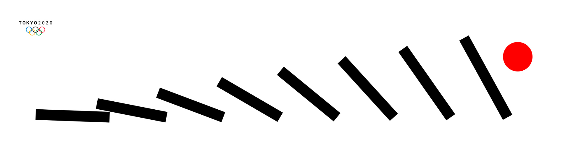
The logo consists of two rectangles of different lengths and a circle, simple geometric forms that can combine following a few basic rules, a modernist, clear and crisp typeface and the mandatory Olympic rings.
With this system put in place there are a huge number of possibilities to construct a strong visual identity that keeps it’s core idea anchored in geometry and at the same time adapts and evolves according to the context as required.
After finally submitting my design I realised that I was one out of almost 15000 entrants into the competition. I had faced harder odds while running marathons. Take the Berlin marathon for instance, the most competitive marathon in the world. Last year, in 2015, out of almost 28000 entrants I came in 116th. I never once thought I was going to win it but when the gun goes off, in the midst of the fear and excitement, you can’t help but thinking that maybe that will be your day, maybe everything will fall into place and you will achieve something that you thought at first was almost impossible. One can dream.
As in the race, I gave it an honest effort with the logo and when that happens you can’t help but be proud of your work, even when there is no compensation in the end but some blisters and a pair of sore legs. I didn’t earn any prize money for 116th in Berlin either, but I did at least get a medal and an overwhelming sense of accomplishment, at having worked my ass off for four months juggling life, work, family and training in the best way I could just to be able to give it my all and see what I was capable of doing come race day.
A final selection of four logos was made and in the Spring of 2016 the winning design, Harmonized chequered emblem by artist Asao Tokolo was chosen as the logo for the Tokyo 2020 Olympics.
I don’t know where I finished. Design can’t be judged with the same finality as a race, but I was glad to have taken part.
“The most important thing in the Olympic Games is not winning but taking part; the essential thing in life is not conquering but fighting well.”
— Pierre de Coubertin

Meter takes a long form look at the hidden side of running culture and at the athletes, heritage and events that continue to make running the greatest sport in the world. Subscribe to the print magazine at Tracksmith.com. Issue #04 is out now.